)%20(4).png)
PURPOSE:
The Collective’s aim is to grow a community of like-minded individuals who all share a passion for the gaming industry and Esports. The website creates a space where users can stay updated with the latest gaming news, insights and content. In particular, an online space that encourages community, with future plans to expand the website and introduce membership options and community discussion areas.
AUDIENCE
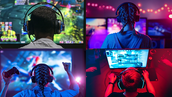
The primary audience for The Collective is representative of the demographic of consumers in the industry, with 18- 24-year-olds being the primary target audience (Clement, 2022). Consumers within the age bracket of 18-24 are part of the “attention economy” where content is expected fast, all the time, and accessible from anywhere (Spero and Stone, 2004) so it's important the website chose content which would instantly interest viewers through colour, imagery or text.
.png)
.png)
DESIGN CHOICES
COLOUR THEORY
The Collective in particular uses a white to a black palette as the primary design influence. This focuses on using colour harmony between the two contrasting colours. Colour contrast between text and background is vital when it comes to web design. These colours can easily affect some people’s ability to perceive the information (visually) (Morton, 2016). Organisations such as WCAG highlight and stress the importance of using a contrast ratio of at least 4.5:1 (Web Accessibility Initiative, 2019). The Collective uses over 50% contrast which is deemed accessible under the WCAG guidelines. Colour wheel theory was also implemented by using a monochromatic colour scheme for icons, titles and important signpost identifiers. The website utilises spot colours with different hues of orange to provide interest and contrast to the pages without overwhelming the space. Szabà et al (2010) reflect this view and state that when constituent colours have the same hue, then they are more harmonious than colours with different combinations.
.png)
WEBSITE LAYOUT
The website is designed with a minimalist style with lots of negative space around the content designed to let the website breathe for the user allowing for greater accessibility, and usability (Babich, 2021). Scrolling effects and animated pictures are utilised throughout to make the whole user experience seamless allowing for the greatest amount of engagement during the session duration.
.png)
TYPOGRAPHY
The Collective opted for using a bold version of the “Arial” Typeface and a smaller “Avenir/Avenir light”. Typefaces elicit psychological associations that can have an overall impact on effectiveness (Kim et al., 2020). The website, in particular, utilises the San Serif font Arial in a number of ways, including grabbing the reader's attention, site accessibility and hierarchy for information. The Typeface and font were chosen to have their own characteristics which help to influence and reinforce the brand's personality perception. Arial has weighted characteristics and can be perceived as being modern, competent, and minimal which reflects the website's style (Grohmann et al., 2012). Thus being more appealing to the intended younger target audience.
.png)
CONTENT CHOICES
CONTENT RELEVANCE
The content within the website aims to be interactive in a visual way and includes animated visuals such as GIFS so that the viewer has another way to engage further with the online environment. Visual animations can be used in order to create a persuasive and interactive experience, the website uses visuals with impact to be the focus of the experience (Jones, 2011). Visual content like videos, images and animations are used throughout the website purposely chosen because it is often this type of content that is prioritised in the early visual attention of viewers (Brady et al., 2020).

IMAGERY
Imagery is a key component in generating an emotional response from viewers, and visual elements can aid the user in their perception of the experience (Britton, 2022). The imagery featured within the website is relevant to the areas in which it aims to promote and engage. By using lots of topic-relevant imagery, the intention is to create favourable attitudes towards the website and more behavioural intentions (Kiss and Esch, 2006). The images chosen are all relevant and symbolic of the context of the website and for the younger audience. Often reinforcing messaging central to the world of Esports like that of “Teamwork” and “Collectiveness” “community”.
.png)
BLOG
The blog is used as part of the wider content strategy because it allows for greater customer relationship building. As well as this, it helps to create further brand visibility and awareness. The blog features both visual elements such as images and informative elements such as long-form text to enable users to create high levels of interaction and loyalty to the brand (Fu and Chen, 2012).
.png)
STORYBOARD VIDEO
The video is reflective of the colour theory and also uses visual imagery and music to engage the target audience further. As stated earlier the attention span of viewers is very limited, the video uses punchy music and bold visuals changing regularly to keep the viewer engaged in the content. The music chosen for the brand video is rhythmic and creates greater salience with the content, and aims to provide structure to the video helping set the pace for each scene (Huron, 1989). Stroyboarding is effective within a design situation because they demonstrate context and reason for the work (van der Lelie, 2005). The video was storyboarded to identify the purpose of each scene of the video. Furthermore, the video keeps the brand at the focus of the messaging constantly reinforcing keywords associated with The Collective’s offering to viewers (e.g. Content, Insight and Community).

LOGO DESIGN
The overall design of this logo helps to establish a clear sense of corporate identity. The logo was created with the goal of getting the viewer to perceive every aspect of the corporate identity in a clear and positive way (Markwick and Fill, 1997). It is consistently placed throughout the content within the website to reinforce brand salience for the target audience. The logo was created to conform to six different design theories of reasoning. These include metaphors, symbolism, colour theory, geometry, aesthetics and the gestalt principle.
.png)
FUTURE COLLABORATION
Partnerships are vital because they enable brands to connect to a wider base of customers and increase their reach (Muci, 2021). Rather than build a team the aim of The Collective would be to grow a self-sustaining audience through content partnerships, discussion forums, and social platforms. The website is centred around four objectives growth, partnership, innovation and community. The website lays the foundations for opportunities with larger partnerships with Esports organisations, social platforms and creators to arise. long-term sustainable growth for any brand increases the efficiency of the online space (Power, 2005) and this is why the website puts this at the forefront of its design choices and user experience.
.png)